

Last year, my friend Jack Karski and I had some talks about all of these projects we think could be fun to collab on. Tons of ideas, but no time to do them.
But 6 months ago, we were finally able to start on our first one; an F1 helmet design for driver Daniel Ricciardo.
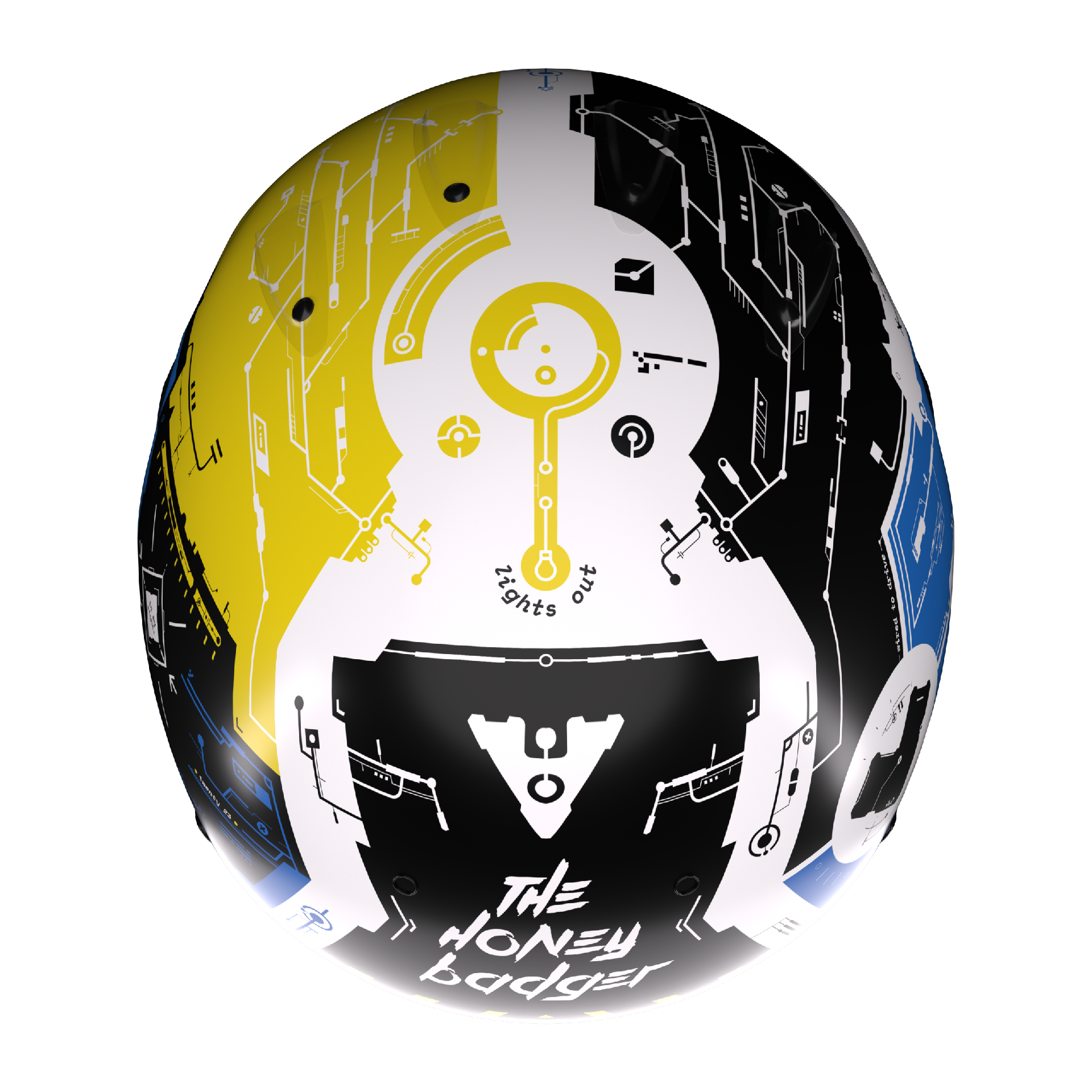
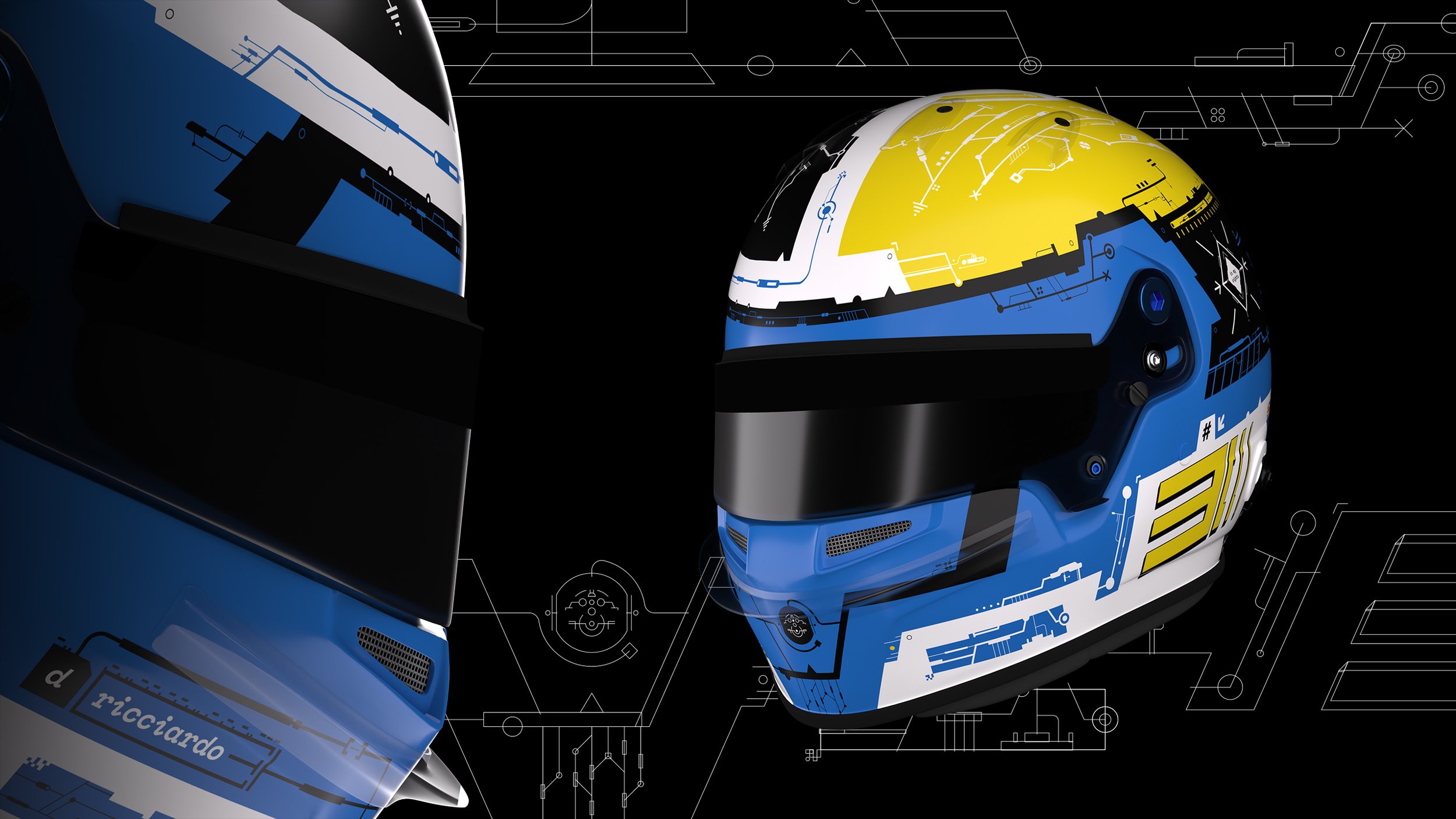
All of the research, concepting, searching for the perfect helmet model, and finally designing has finally paid off. A helmet that we think is completely different from any others that have been done in the past. Taking the colors and Wrangler horse seen on the car driven by Daniel Ricciardo hero Dale Earnhardt, and combining it with a futuristic and asymmetrical style, we think it not only looks sick as fuck, but shows that graphic design can be intricate, complex, and maybe even a little unnecessary. So much design seen by the majority of the public is too boring and minimal nowadays, so we hope this acts as an opportunity to get people to see a fresh new take on what design can be. F1 is a science-based sport anyway, so why not lean into that aesthetic?
Everything was manually created and handplaced, so lots of love and care went into this. There was constant double-checking and making sure everything fits together. If one element would move, everything around it would have to be shifted as well. So much just staring and thinking what next? What form would look good here? How can it all feel cohesive and not just a bunch of random graphics places around like stickers? I'll probably share some of what was first designed so people can better understand. Designing on a 3d surface is challenging, so making sure it looks good from all angles isn't easy. Plus how the helmet was unwrapped made combining the top elements with the back and sides was a bitch, so that's why you'll see some weird angles if you look close enough.

We hope everyone likes the design, or at least understands what it's all about. Traditionalists probably won't care for it but that's fine.


This one was designed to show an appreciation for traditional Japanese design, by combining simple and bold shapes and design elements with a much more organic and handcrafted one. Blank space was also given to leave room for sponsors.
Something fun to know; the red bolt on the right of the helmet symbolizes the sun rising in the east (would be on the right if facing north).
This whole project was quite time consuming for us, but we’re proud of the final results. Getting to at least complete a project we’ve been excited about for so long is incredibly rewarding. Seeing this be used by Danny would of course be the ultimate prize, but we won’t get our hopes up too much ;).
If you’d like to support us and help turn these into the real thing, we’d greatly appreciate you spreading the word. Just sharing it on social media, and tagging the appropriate accounts is enough. Thank you!


